Wild Moon
Wild Moon design and create Boho inspired wedding stationery for modern and creative weddings. Emily, who is the designer and creator of Wild Moon, wanted to take her brand to the next level, and own a design and strategy that better represented the products on offer.
Previously, the business was named Design By Emily and matched in style to Emily’s personal tastes of dark and moody colours with fresh whites and greens. Whilst it can be important to have a brand that reflects the style of the owner, in this instance it was important for the brand to be removed from Emily’s personal tastes, and illustrate the Boho nature of the stationery designs themselves. We threw around a few new name choices until opting for Wild Moon, which perfectly captured the spirit and energy of of the Bohemian aesthetic Emily’s designs had become known for. With a new name in place, this redesign needed to give Emily clear strategic direction, and a design that can take her into a further 10 years of business.
BACKGROUND


Solution
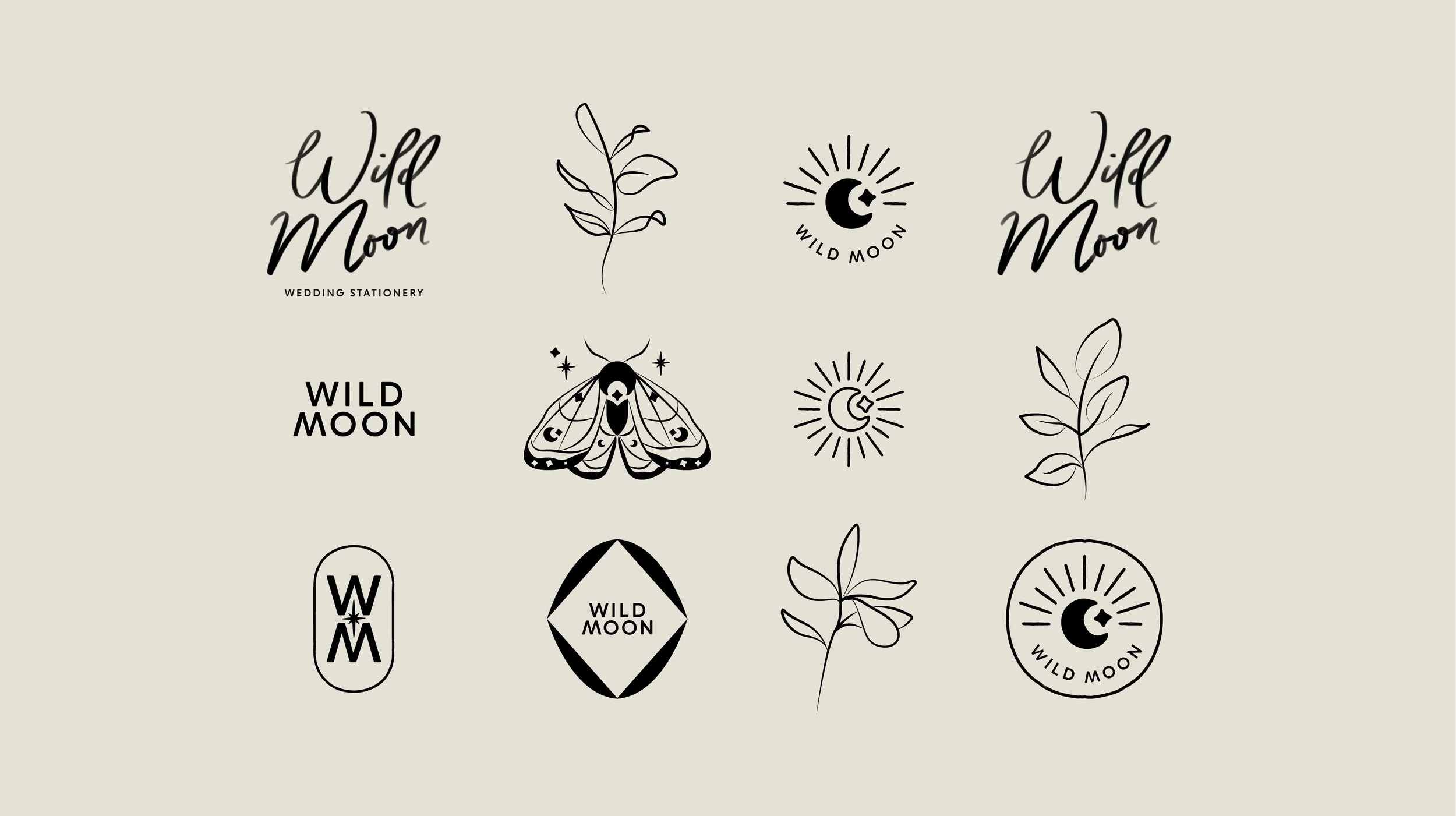
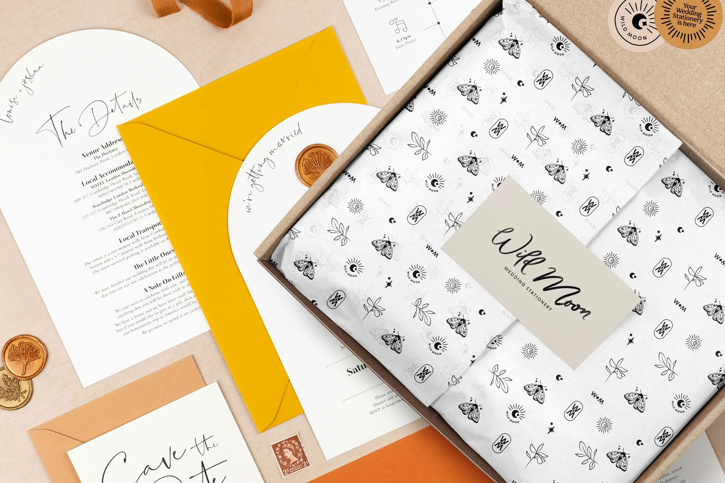
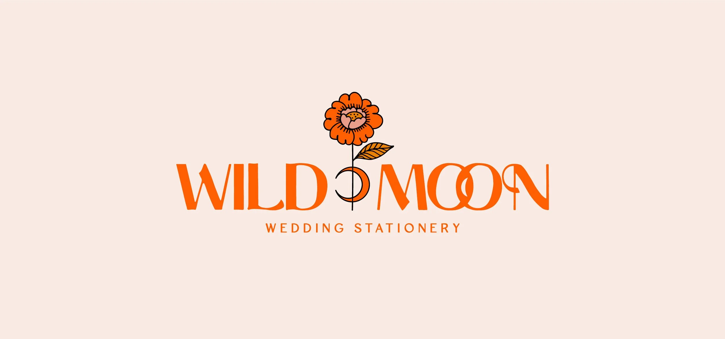
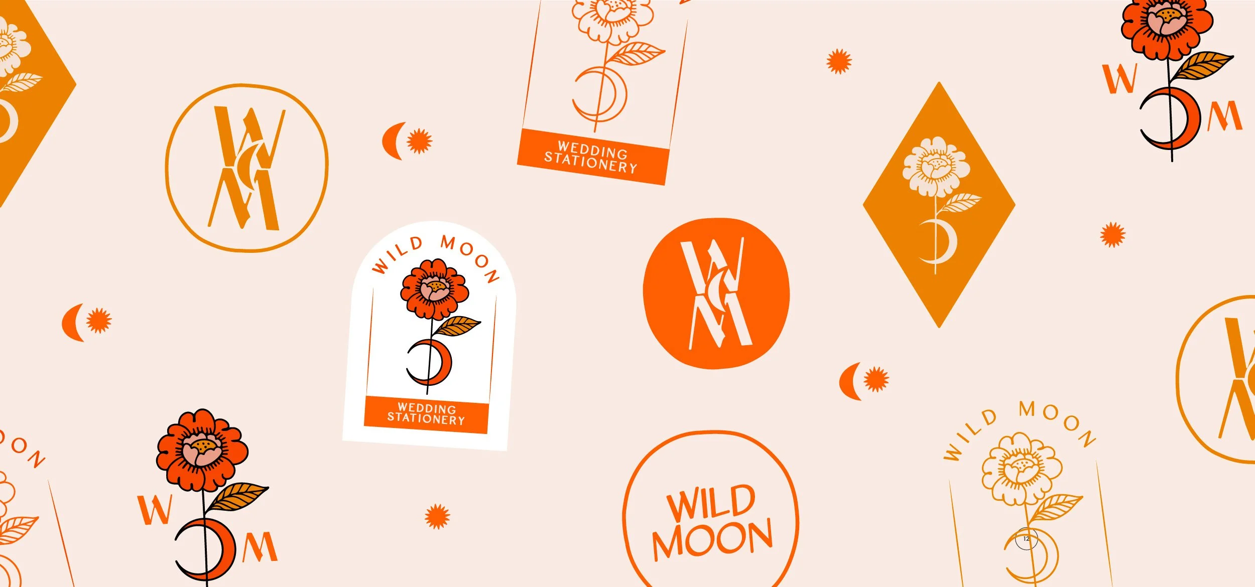
The logo design was an important first step in setting the style for the brand. A hand lettered logo was designed with a soft, ink brush application to really highlight the free spirited and free flowing feel, which then flowed into the botanical line illustrations giving a nod to the illustrations often found in Wild Moon’s designs.
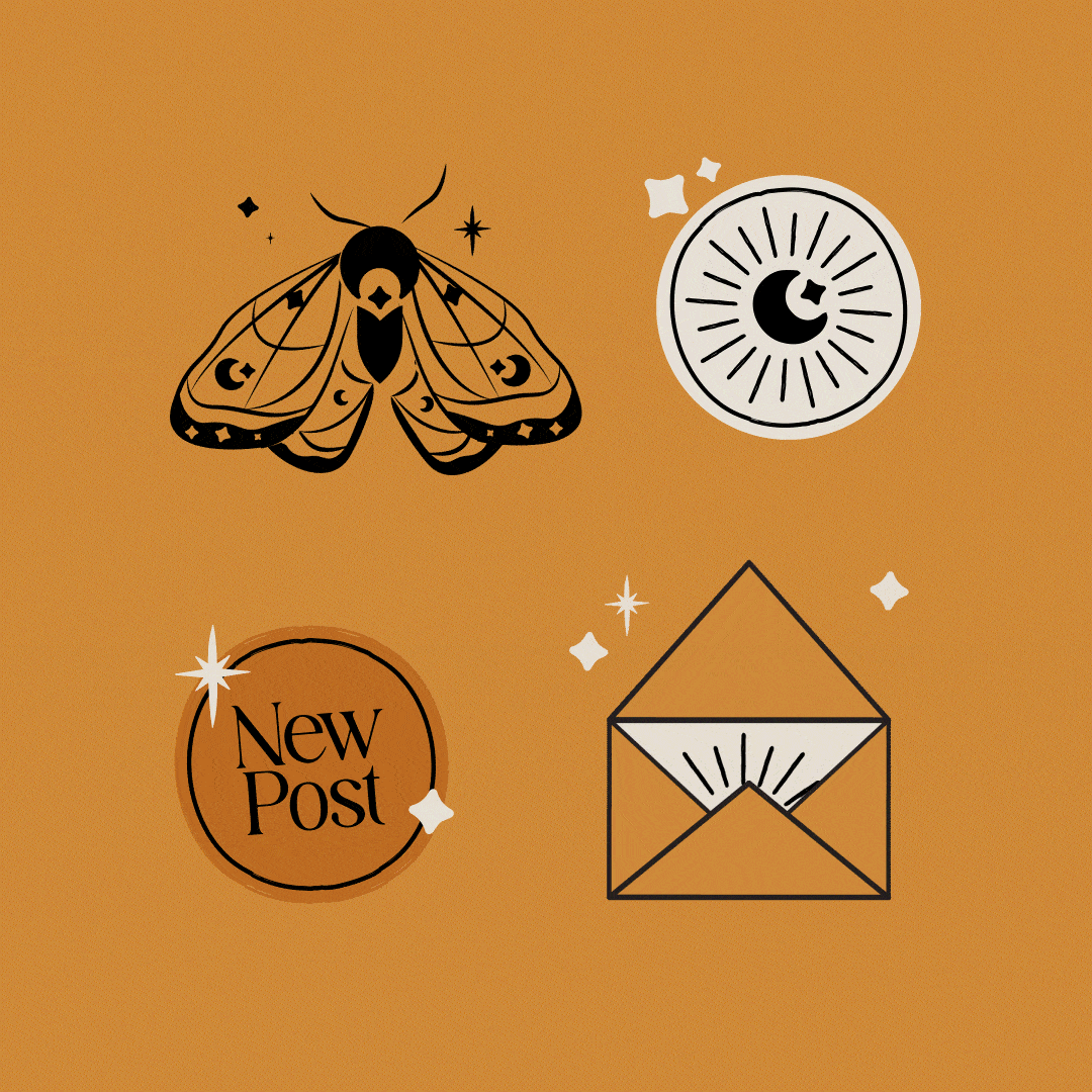
A large variety of submarks were designed to show an abundance of brand style and give real confidence to the brand with intently mixing the hand lettered logo with stronger, more robust type styling for branded marks. A moth illustration became a brand symbol with adapting the moon and star shape into the line work, and felt the perfect character to animate for use on digital and social media applications. The strong black style gave a subtle nod to Emily’s previous brand and own personal style, as even though Wild Moon is no longer a representation of Emily, she is still connected and stylistically attached to the brand in a way that shows a deep connection to herself and her beautiful design work.
Wild Moon’s implemented brand strategy now gives Emily a brand with clear direction, and a brand design that attracts her dream Boho loving, modern inspired couples straight into her inbox.
Portrait photography by: Gina Fernandes
Product Photography by: Holly Booth Studio


“Vicky has recently finished my rebrand and I could not be happier with the results!
Being a designer myself, letting someone else take the reins on redesigning my brand with a fresh eye, was a daunting idea, but I decided to work with Vicky because not only was her work great and very varied, I knew she had a background in wedding stationery and focused not only on branding, but on brand strategy too (which I really needed help with,) and I was not disappointed!
Vicky was amazing to work with! Not only is she just a really lovely, approachable person, she really knows her stuff too.
When I decided to go the whole hog and change my entire brand name she was so helpful through the whole process, making suggestions and bouncing around ideas with me. She was so thorough with everything she did, proving detail and explanation behind every decision and idea.
She was really patient and listened to everything I had to say and took my ideas and thoughts into consideration, making it a real partnership and allowing me to make my mark on my own business too.
I can't wait to get my new brand out into the world and I can't recommend Vicky highly enough to any small business who is looking to invest in a rebrand!”
-EMILY REYNOLDS, OWNER & DESIGNER


Logo Graveyard
WELCOME TO THE LOGO GRAVEYARD, WHERE IDEAS AND CONCEPTS THAT DIDN’T MAKE THE CUT LAY TO REST. LEST WE FORGET.
CONNECTIONS
This design shows a strong and dominant type style with added natural curved shapes to bring in a more humble feeling. The overlapping ‘o’s bring a great opportunity for character and a subtle way to bring in a moon shape into the design. By connecting the letters it builds the story of togetherness, both for Wild Moon couples getting married and Emily’s personal connections to her clients.

ADAPTABILITY
This design holds connections to the adaptability within Wild Moon’s services as they become the no.1 choice for flexible, and adaptive template designs. The logo takes on a more simplistic approach, and shows how the letters have been adapted to show visual stars connecting to the brief.