Molecule
BACKGROUND
Molecule bring an eclectic mix of modern & Mid Century homewares to Brighton’s North Laines both in their bricks & mortar shop and online store. Tasked with bringing in a new lease of life to the business, it became important to create a brand that represented the diverse range of products on offer, whilst delivering the look and feel of vintage meeting modern.
The store was born from of a passion for vintage finds that evolved into creating a space to share with customers who value and appreciate the same design style & ethos. With products ranging from furniture to smaller homeware items it was important to represent the range whilst maintaining a considered and purposeful collection.


Solution
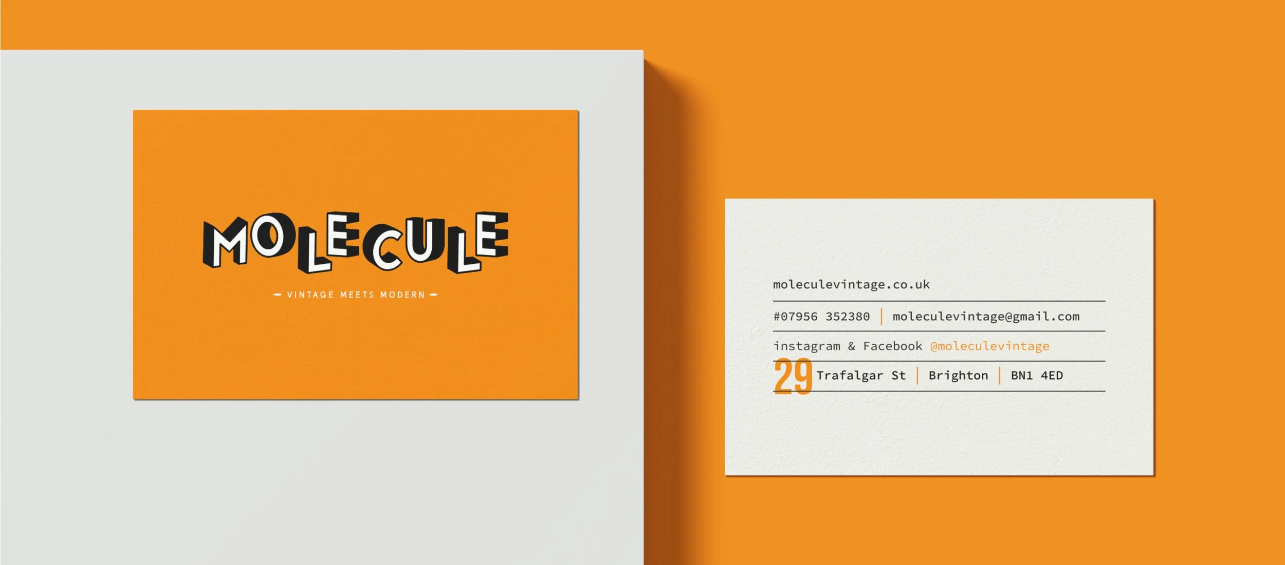
The brief was centred around giving Molecule a more memorable and unique design after making do with their home DIY logo and one colour palette for their first few years in business. Together we created the strapline ‘Vintage Meets Modern’ which formed the direction to combine a modern graphic design, with the right hints of vintage styling.
Graphic line illustrations of the products were created to give the brand a graphic voice, which were perfect to use on branded collateral such thank you cards and packaging for online orders. The strong branded orange became a real statement for the brand and was designed to highlight the bright and bold products found inside the store, as well as giving the street in which the store is situated a real kick of colour. It went through many iterations and every shade of orange imaginable, but eventually came together alongside black, cream, racing green and brown. The perfect blend of vintage meeting modern.


“Vicky was amazing when we needed a rebrand for Molecule. From our initial meeting til handover of the final designs, she was super patient, friendly, understanding and generally great! All the design options she presented us with were fab and nothing was too much trouble. I was so happy we worked with Vicky.”
-LYNDA SAUL, OWNER


Logo Graveyard
WELCOME TO THE LOGO GRAVEYARD. WHERE IDEAS AND CONCEPTS THAT DIDN’T MAKE THE CUT LAY TO REST. LEST WE FORGET.
ATOMS
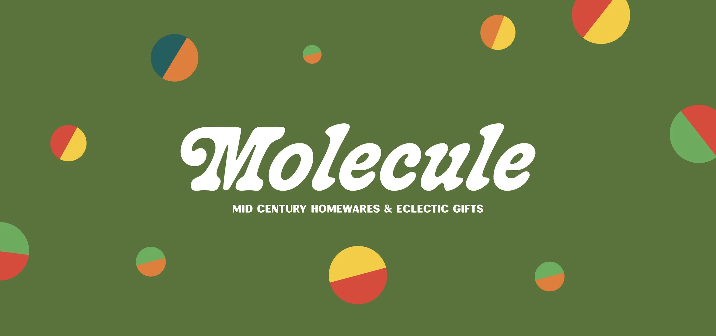
When thinking about the brand name we associate the theme of science and the famous molecule structure that started off the business journey. With the idea of graphical molecule structures, this design shows how we can incorporate representing molecules in a modern way whilst retaining a vintage feel. The bold and graphical style of the atoms gives a very playful edge to the brand design, whilst the confident and vintage logo style connects us back to the products on offer within the shop.


PERSONABLE
This concept utilises illustration to show a deeper understanding of Molecule and what it offers to it’s customers. Vintage style badges reminiscent of Scout style design shows directly the types of products on offer within the shop, that reflect vintage posters typically seen in hardware stores during the 50’s & 60’s. The script style logo also allows for a more personal connection to reflect the idea of handwriting, and mimicking the classic style logos of brands we have come to know and love from this same era.