Lauren Beth Photography
BACKGROUND
Lauren is a Sussex based wedding photographer specialising in outdoor, woodland weddings. Lauren loves to work with couples who embrace the outdoors and she takes real pride in being able to capture those unique, personal moments. She spots connections in the room and documents these in a way that illustrates emotion and clarity. Her clients willingly give Lauren full trust as her approach is sensitive and invasive, making them feel relaxed and confident.
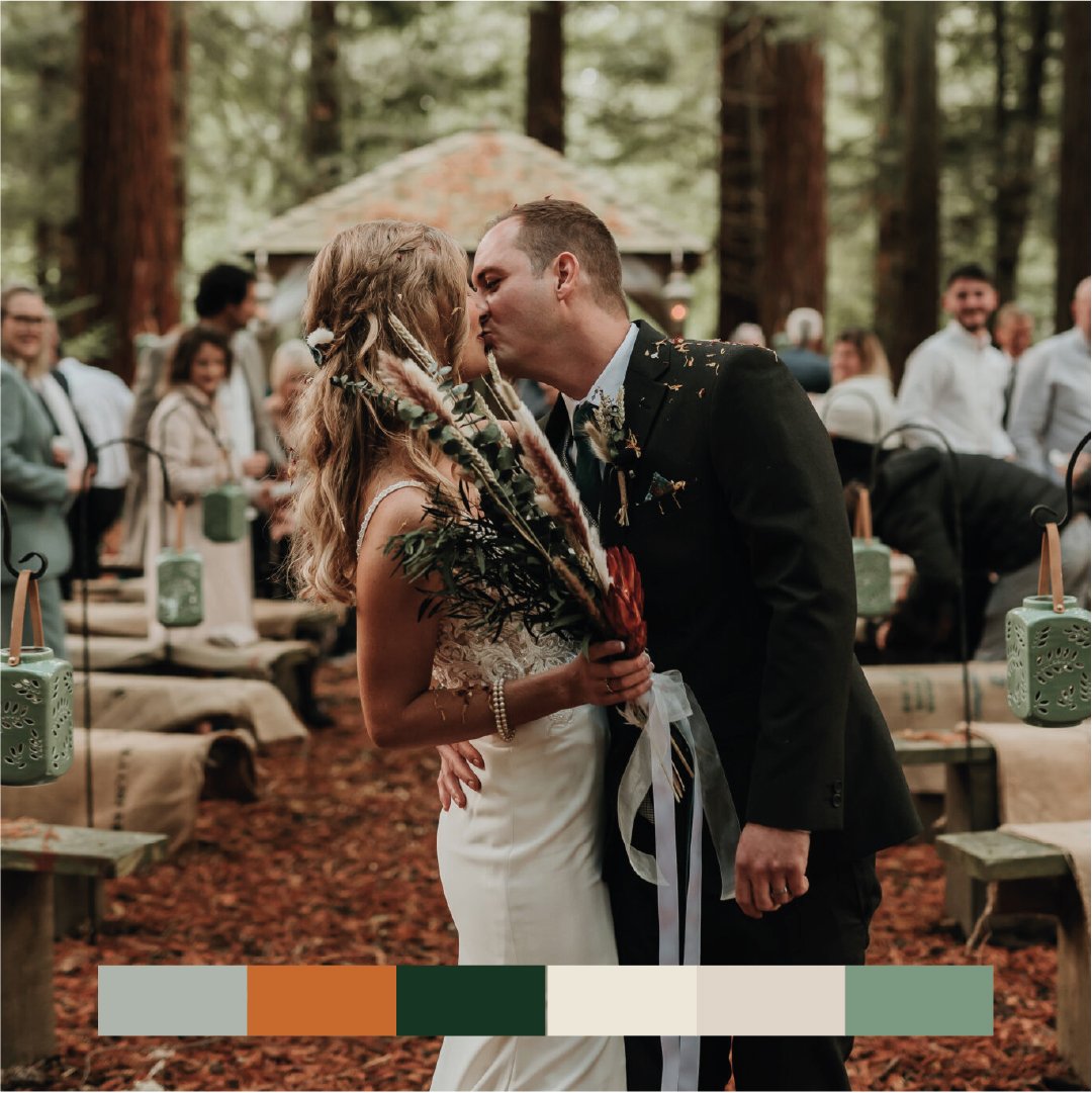
Lauren was looking for a redesign to give her brand a new lease of life, and to take that all important next step in her career. It was important to me that I gave Lauren a design that was a true representation of her own tastes, after all her photography is a creative extension of her own personality. With couples selectively choosing suppliers for their day that they feel a genuine connection with, the brand design needed to represent the exact type of couple it was perfect for; outdoor enthused weddings with a charm of autumnal styling. The perfect combination of Lauren and her beautiful photography work.


Solution
During the strategy phase it became apparent the brand would be suited to have a strapline that embodied the emotion and feeling of an outdoor, woodland wedding. ‘Soulful and intimate photography, making you embrace the beautiful outdoors’ became the mantra for the brand, and helped to establish a unique point of view against the plethora of wedding photographers in the area.
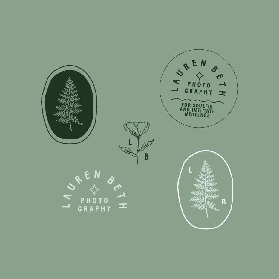
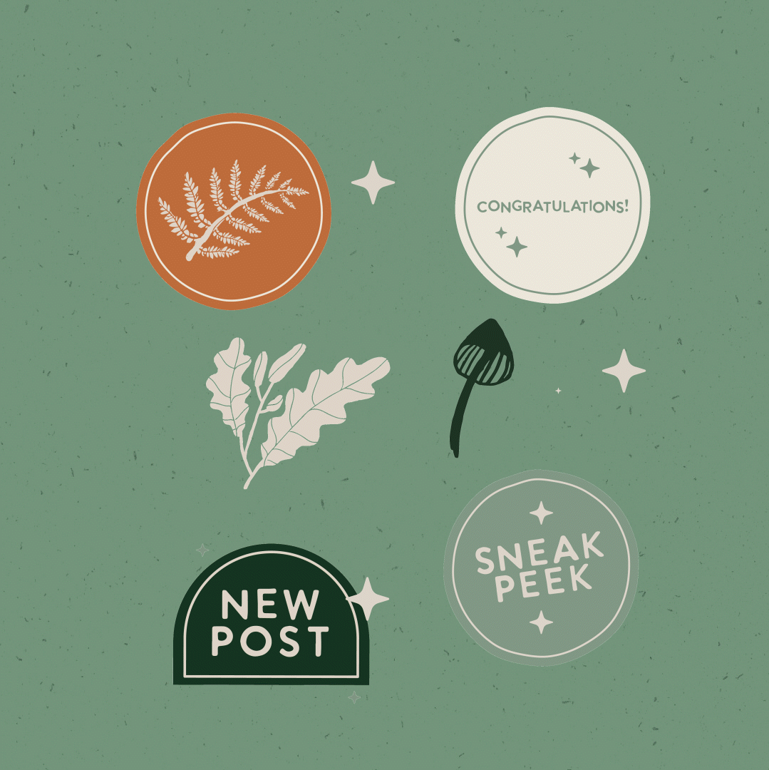
The brand design centred around the idea of a walk through the woods, with hand drawn Autumnal elements making up the brand pattern representing a foragers scrap book, and Lauren’s favourite fern leaf becoming a dominant brand mark used within the main logo.
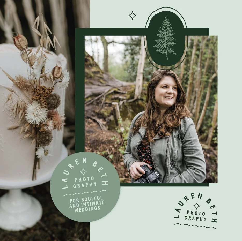
The colour palette went through a few rounds of iterations to combine colours that represented a cosy, woodland walk with fresher, soft greens to also appeal in Spring and Summer, as well as being one of Lauren’s favourite colours. A brand texture is also used which represents a natural, organic pulp feel perfect for use on screen within the brands website and social assests, to keep digital designs in line with the earthy feel of the brand. The final output became a combination of concepts 1 & 2 from the first round of designs, something which is not always possible to acheive, but in this instance, it all came together perfectly.


“I cannot thank Vicky enough for everything she has designed for my business. From my initial enquiry, through to the final product, Vicky was so lovely, patient and an absolute pleasure to work with. I found the whole process of my rebrand refreshing, exciting and overall came away with so much more than I expected.
Being a wedding photographer, it was important to have logos and branding in various file sizes for printing on numerous products. Nothing was too much trouble, Vicky went above and beyond to provide me with everything I needed to launch my rebrand across all platforms and packaging items. If anything, I really wish I had found Vicky sooner!! I am so so pleased with my rebrand and would highly recommend Vicky to any business looking for a graphic designer. Thank you!!”
-LAUREN BETH, OWNER


Logo Graveyard
WELCOME TO THE LOGO GRAVEYARD. WHERE IDEAS AND CONCEPTS THAT DIDN’T MAKE THE CUT LAY TO REST. LEST WE FORGET.
AT HOME IN THE WOODS
The primary logo is made up of 3 different elements including the rounded serif typeface, the illustrated leaf motif and the hand lettered font styling of ‘photography’. The rounded serif typeface has been chosen as the main element of the design to reflect the comforting feeling of the brand, which exudes warmth and familiarity. The hand drawn style has also been designed to portray the personal connection Lauren has to her clients.


PERSONAL CONNECTIONS
This design has been created to highlight the personal connections Lauren makes with her clients, and how this can be used as a main point of difference to your competitors. The hand drawn style of the logo represents your personal mark and creates an openness with your audience. The ‘Photography’ typeface gives the feeling of vintage fonts typically seen in classic books, to give the logo that cosy, warm feeling. More specifically, the pattern has been designed to tell the beautiful unique story of how Lauren’s grandfather taught her photography which was a strong theme that came from Lauren’s client questionnaire. Watercolour illustrations have been made to represent the flowers and foliage that her grandfather hand picked and painted. This story connects back to the personal connection concept, and gives your brand a unique stance against your competitors that you can use to represent who you are, and how you became the photographer you are today.


EMBRACING THE OUTDOORS
This design highlights the beautiful outdoors with the intricate fern leaf and tree ring illustration. The softer colours feel comforting and familiar, and help to portray the natural colours found in the outdoors. The tree ring design has been utilised in the brand mark, and gives the fern leaf a bigger, tree like scale. Simpler typography at a ‘jaunty’ angle represents a hand drawn feel and wouldn’t look out of place in a woodland foragers sketch book.