Paper Adventure Co.
BACKGROUND
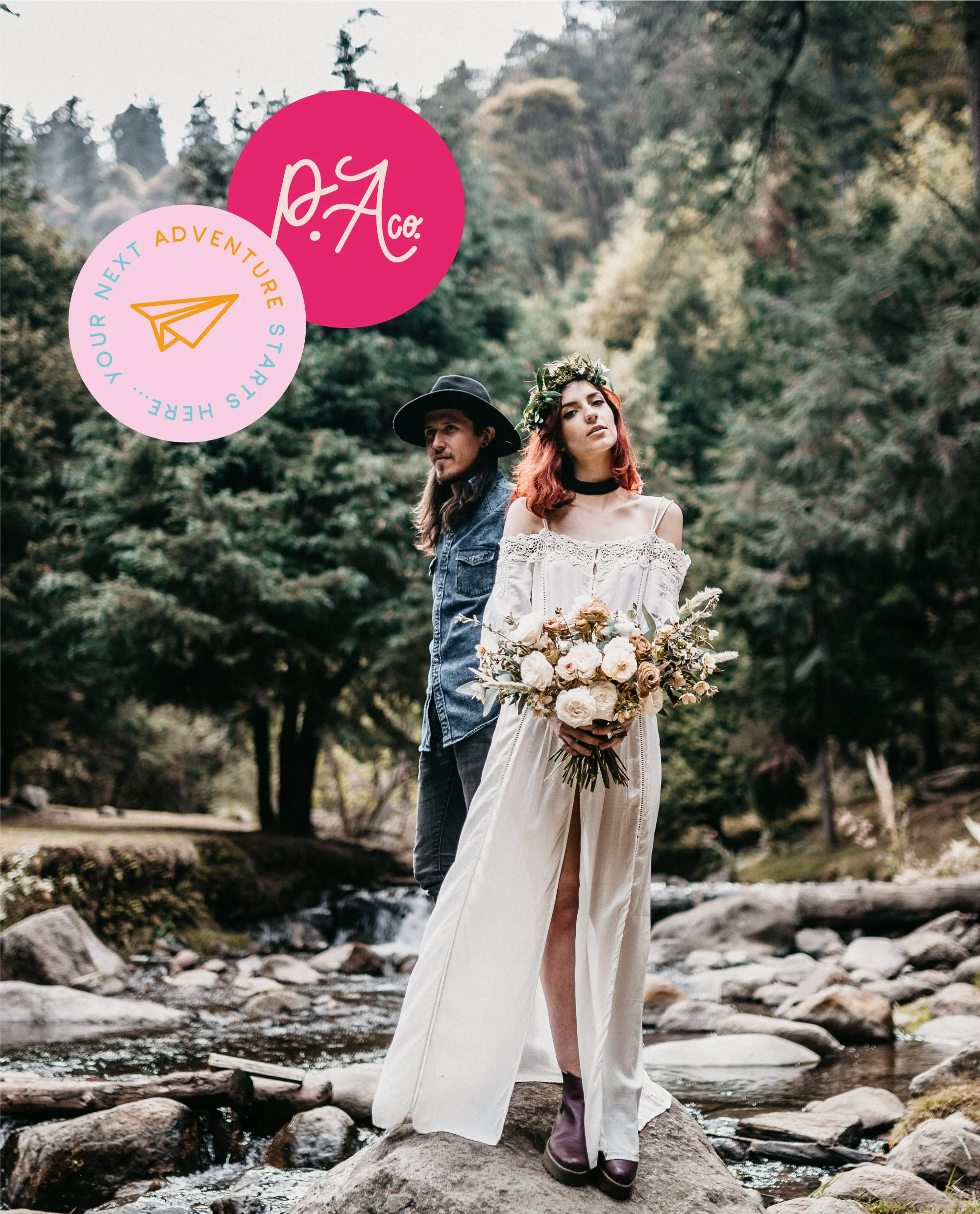
Paper Adventure Co. create wedding stationery designs for travel enthused couples to bring their personalities and unique interests to their Wedding Day. Emily who is the owner and designer was looking to bring a fresh perspective to the brand, and to be able to position themselves as a bespoke service within the wedding stationery realm.
One of the main selling points when working with Paper Adventure Co. is their ability to create designs that are customised and bespoke to them. This re-design focused on this unique selling point with a hand lettered logo to represent the hand made, and the bespoke nature of the products. It also shows a human interaction and connection which is a direct result of working with Paper Adventure Co.


Solution
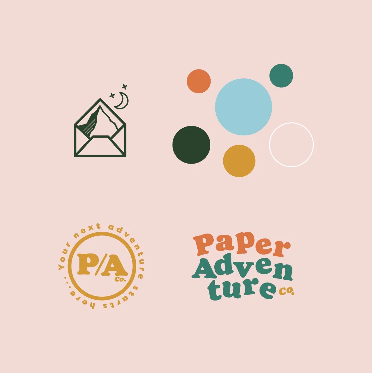
The pattern is made with a range of illustrations representing both Travel & Stationery which are seamlessly linked throughout the brand. It was fun to bring in the travel theme as another point of difference to competitors and to help establish Paper Adventure Co. as the go-to service for travel enthused couples.
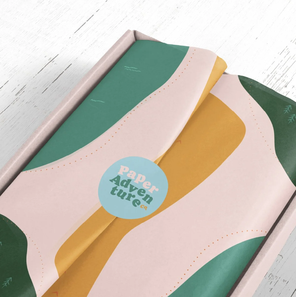
Thank you cards were created with a ‘wish you were here’ postcard feel and the crystal clear blue brand colour illustrating the feeling of sea and sky, the perfect holiday and adventure palette to bring all of the brand elements together.
A textured pattern was created to be used as digital backgrounds that not only reflected a paper texture, but also traditional map lines, to once again fuse the brand connections of stationery and travel. Social media designs were created as part of the full brand package, to give Emily everything she needs to create a strong and memorable brand to her dream audience.


“From start to finish, Vicky was incredible to work with, and I would highly recommend her to anybody looking for an exciting, creative new brand design.
You just need to look at Vicky's portfolio to see how talented she is. Each brand design is beautifully and lovingly created and has real stand out. Mine was no exception! The whole process was super fun and I was always so excited to see what Vicky had come up with.
I've come away with a brand design that makes me feel excited, more professional and super proud. Thank you for everything Vicky! <3”
-EMILY MOORE, DESIGNER & OWNER


Logo Graveyard
WELCOME TO THE LOGO GRAVEYARD. WHERE IDEAS AND CONCEPTS THAT DIDN’T MAKE THE CUT LAY TO REST. LEST WE FORGET.
EXPLORING
What intrigues us about the idea of an adventure is the excitement that comes from the unknown of exploring. This design takes on that idea of the exploration of an adventure, shown through the logoʼs icon of the mountain top - the ultimate adventurers destination. The envelope structure within the icon illustrates that the adventure starts from within the stationery, to relate back to our target audience and to give visual reference to the strapline, ʻYour next adventure starts hereʼ. The pattern design reflects the graphic nature of a map to tie in the idea of an exploration, but shown in a more bold and colourful way to highlight and represent the bold nature of ʻPaper Adventure Co.sʼ products and offerings.
WISH YOU WERE HERE
When considering an adventure there is always a romantic feeling associated to the idea of travel. This design utilises those dream like feelings with a design that reflects postcard lettering, with a graphic sun setting icon within the logo design. The colours are bold and vivid, with a tropical feeling to remind us of our holidays and adventures, many of which our target audience take together. The pattern design shows strong white lines to represent the contrails we often see in the sky, which offer a dream like wonder as to where our adventure can take us.