
DEAR CARMA
Background
Dear Carma is an e-commerce boutique specialising in ethically produced clothing from Indonesia, built around a belief that fashion can be both beautiful and responsible. The brand needed a strategic foundation and identity that could translate its core values into something customers would genuinely connect with, not just another sustainable fashion label, but a brand with a distinct point of view. In a market where "ethical" and "conscious" are increasingly common claims, the challenge was to define what made Dear Carma different, and to build a brand story from the ground up that felt personal, human and authentic to a style conscious, eco aware audience aged 25 to 55.
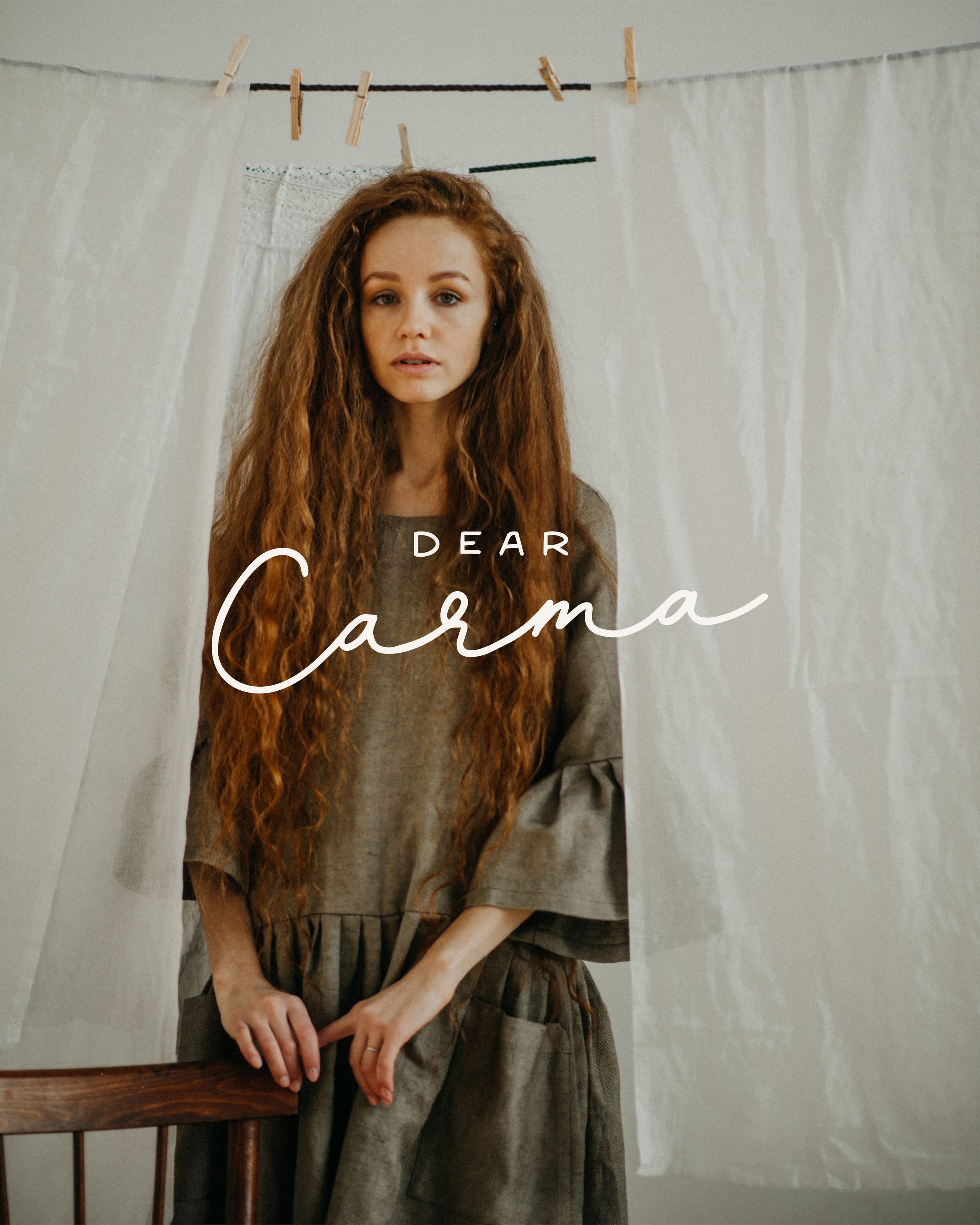
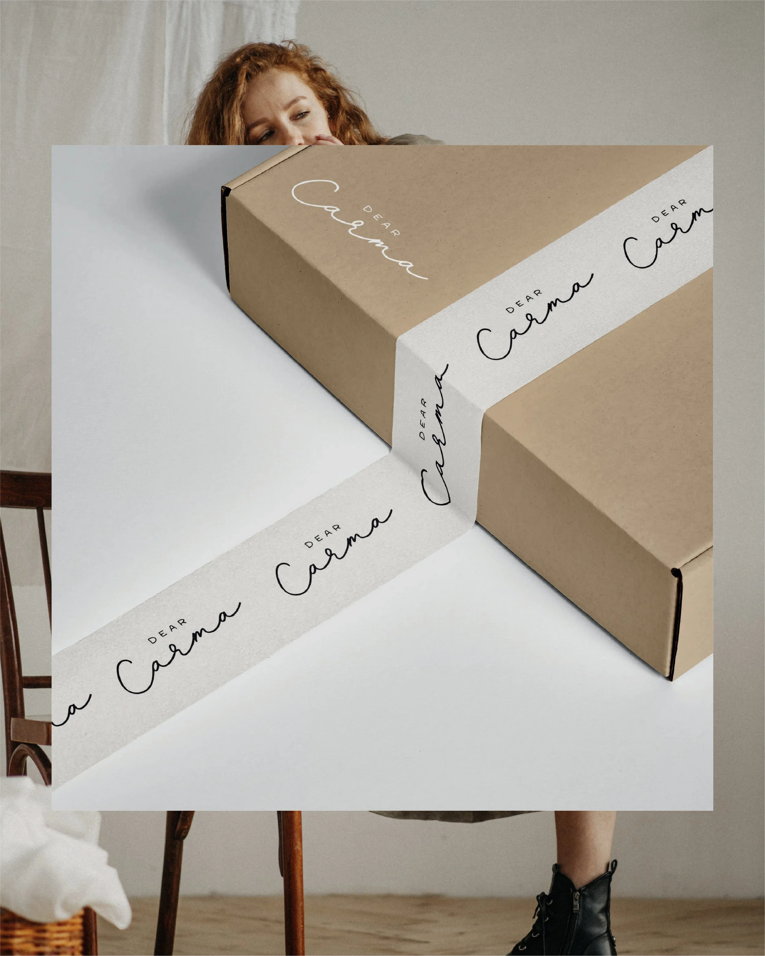
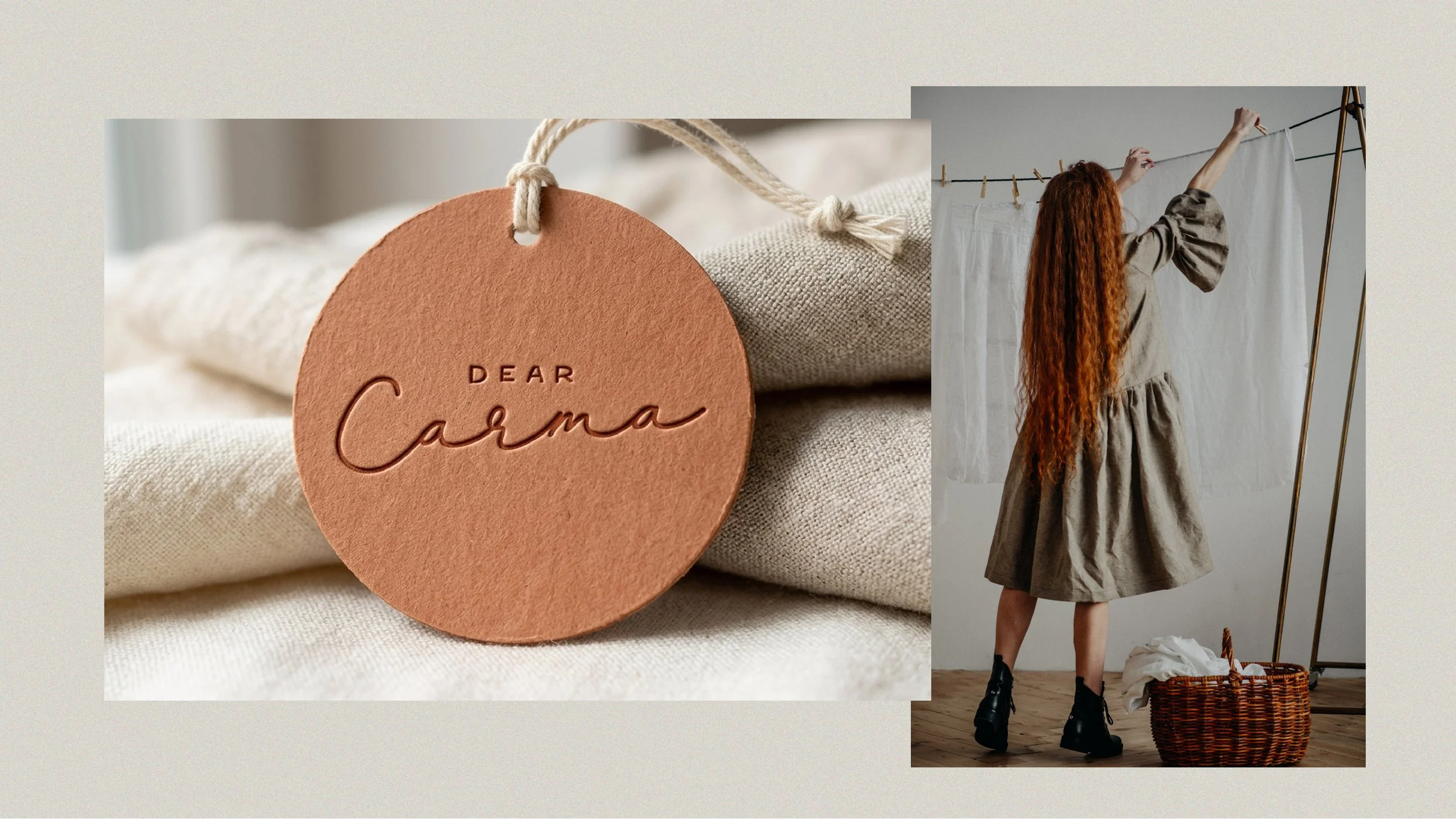
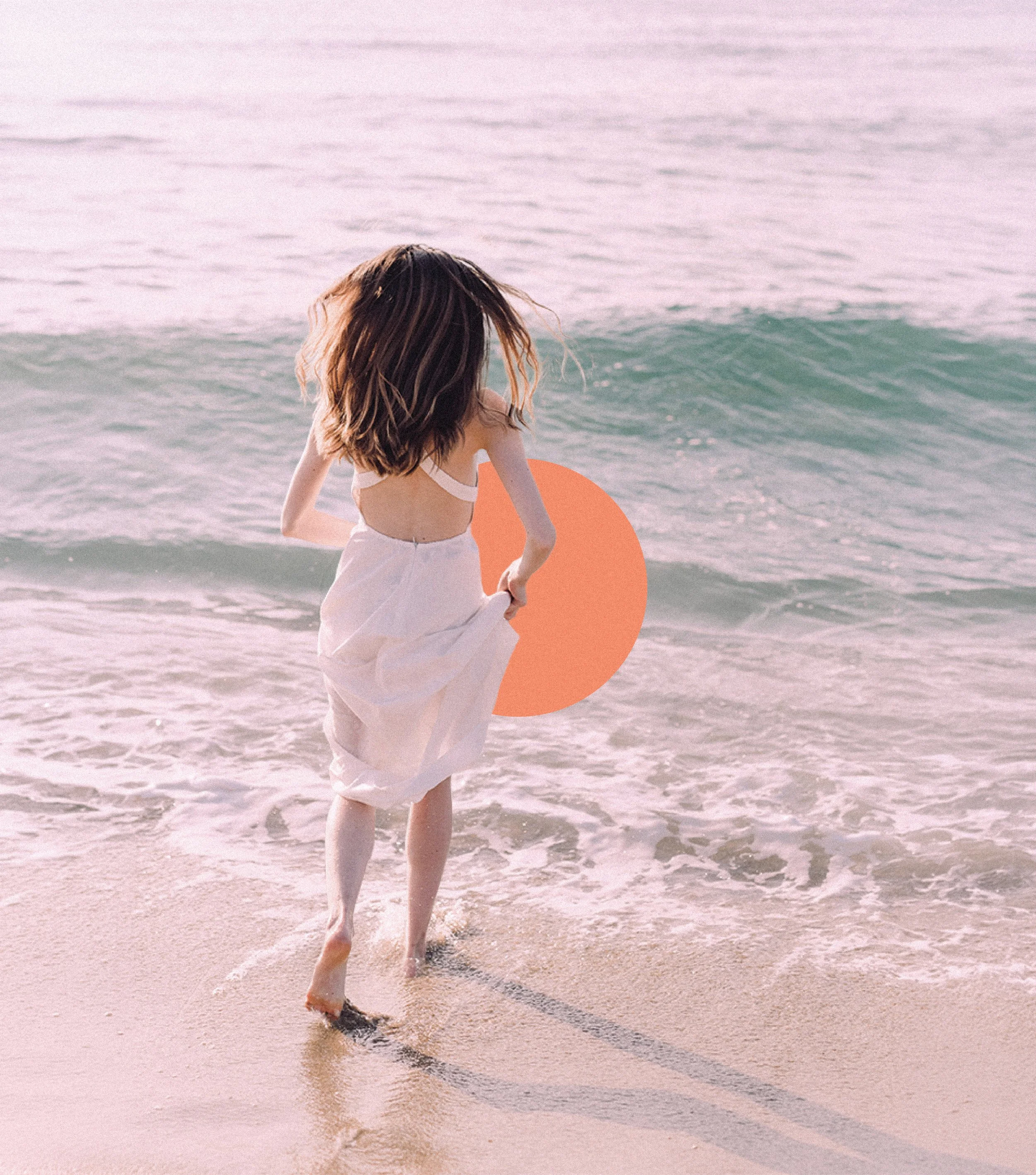
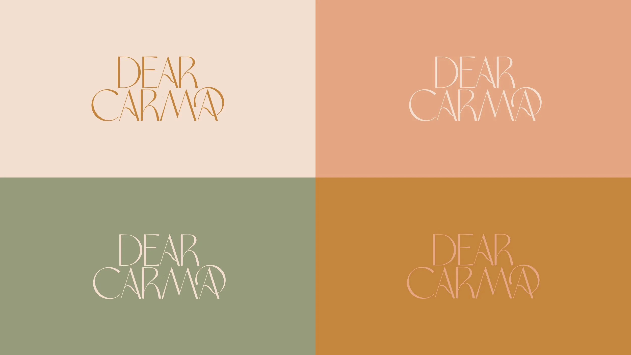
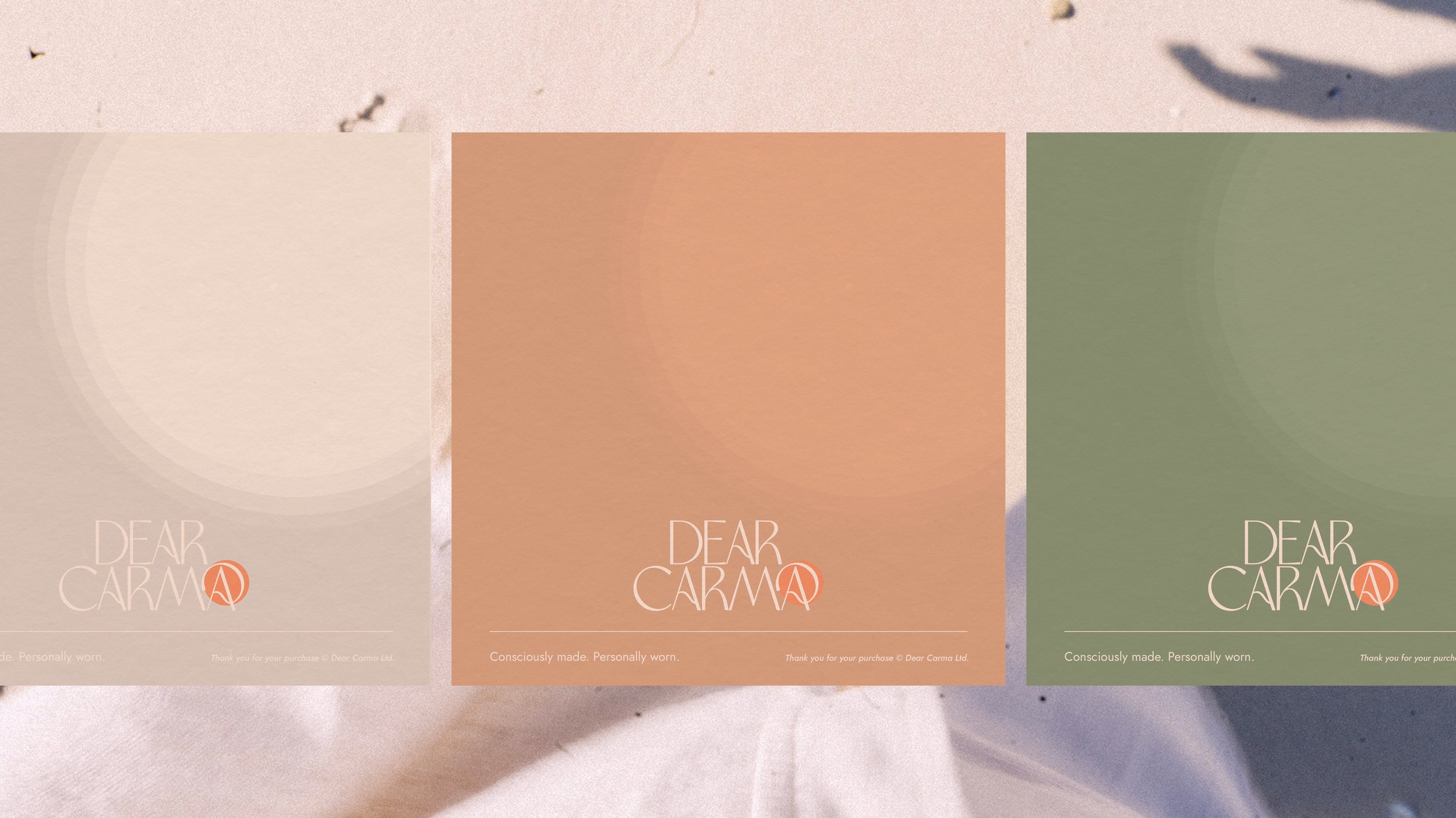
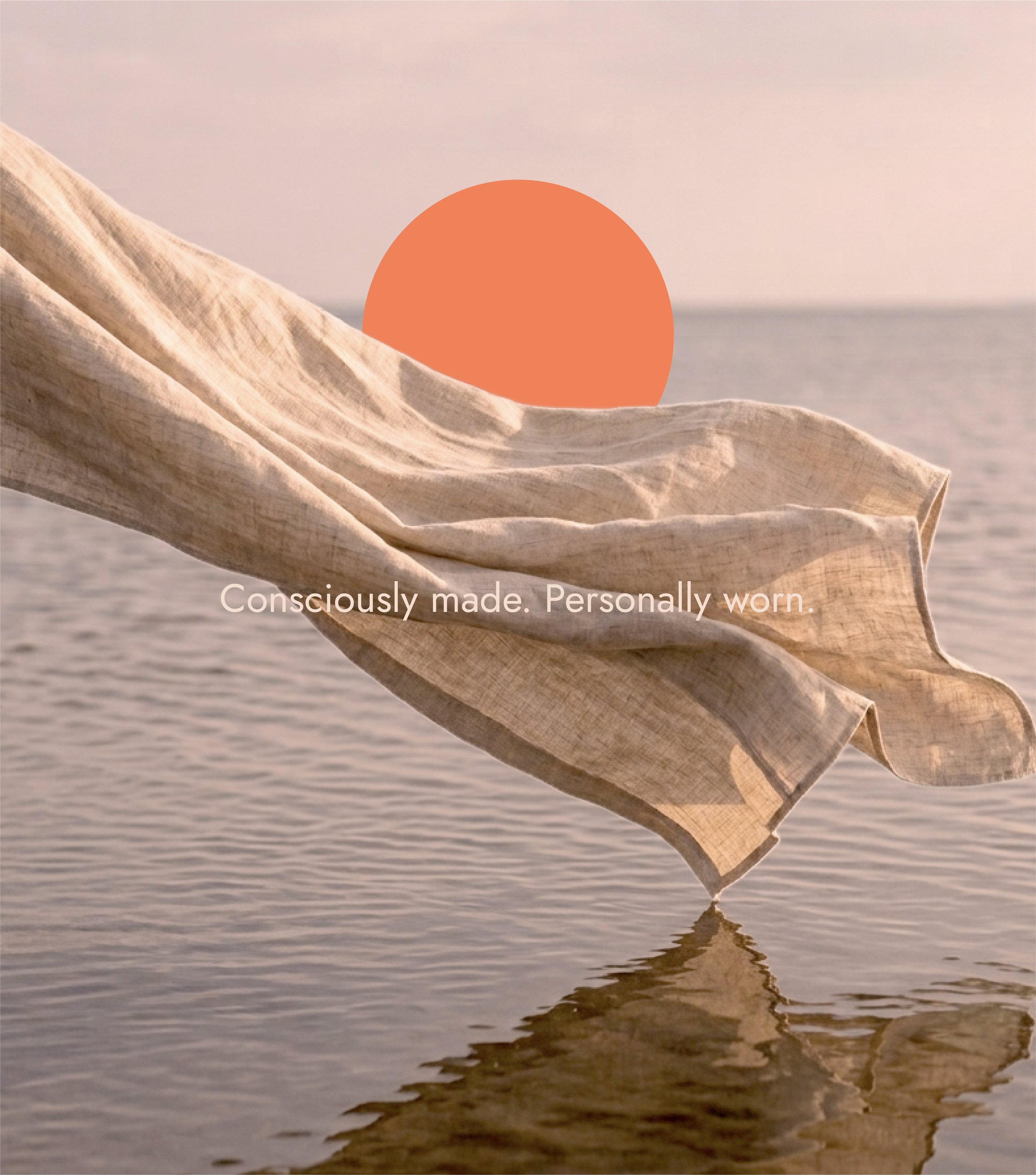
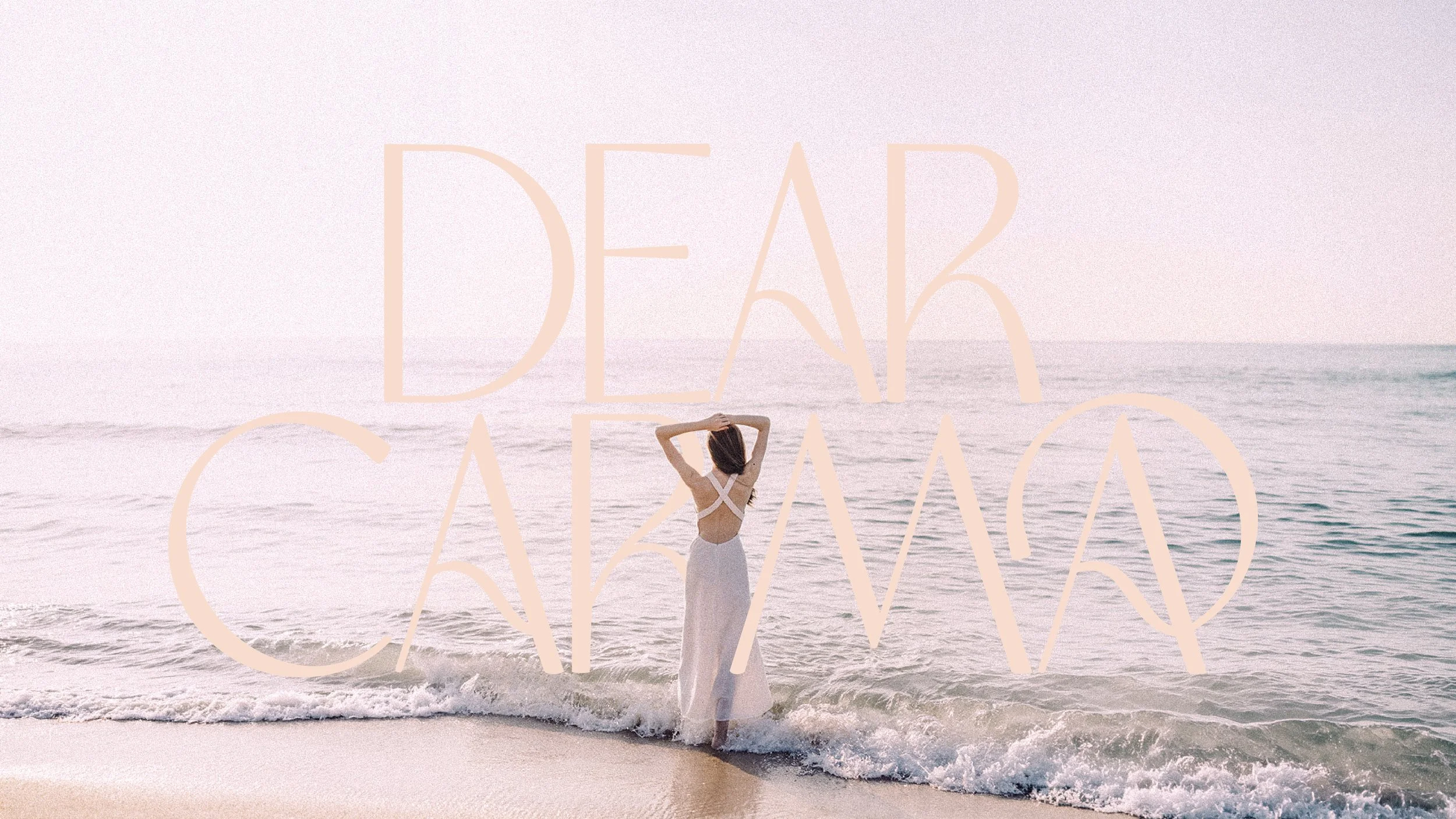
I led the strategic direction from the ground up, defining Dear Carma's brand values, audience and positioning before a single visual decision was made. I identified three core pillars, care, empowerment and consciousness, and built out the target audience profile, competitor landscape and tone of voice to give the brand a clear point of view in a crowded sustainable fashion space. From there, I translated that strategy into a visual direction: a soft, earthy colour palette, organic shapes and modern typography with small, thoughtful details to reflect the brand's feminine, considered personality. I also set direction for photography, real, authentic imagery shot in natural light and settings, to reinforce honesty and human connection at every touchpoint. The result was a complete brand foundation, strategy and visual direction alike, giving Dear Carma a distinctive identity built entirely around a story I helped shape.

Logo Graveyard
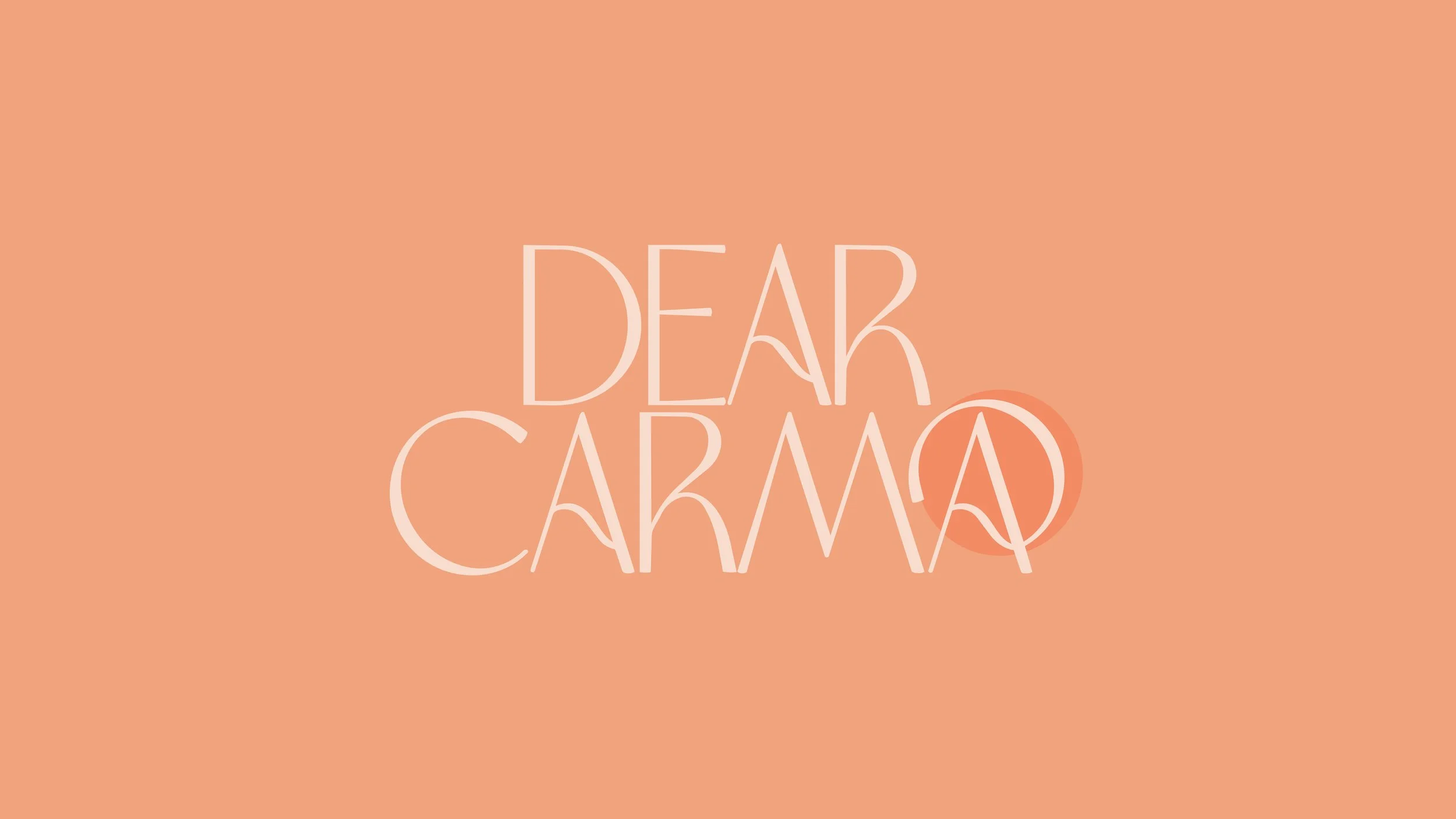
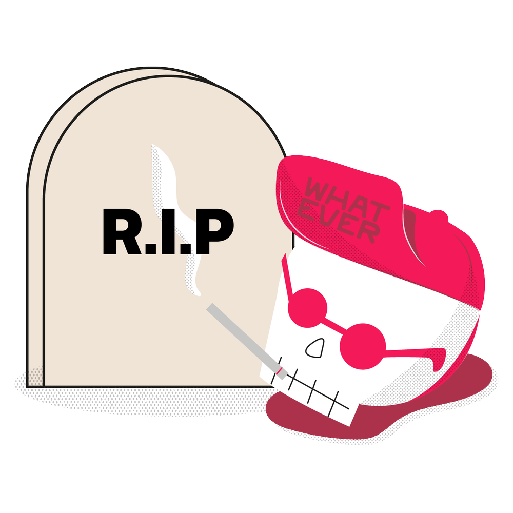
WELCOME TO THE LOGO GRAVEYARD, WHERE IDEAS AND CONCEPTS THAT DIDN’T MAKE THE CUT LAY TO REST. LEST WE FORGET.
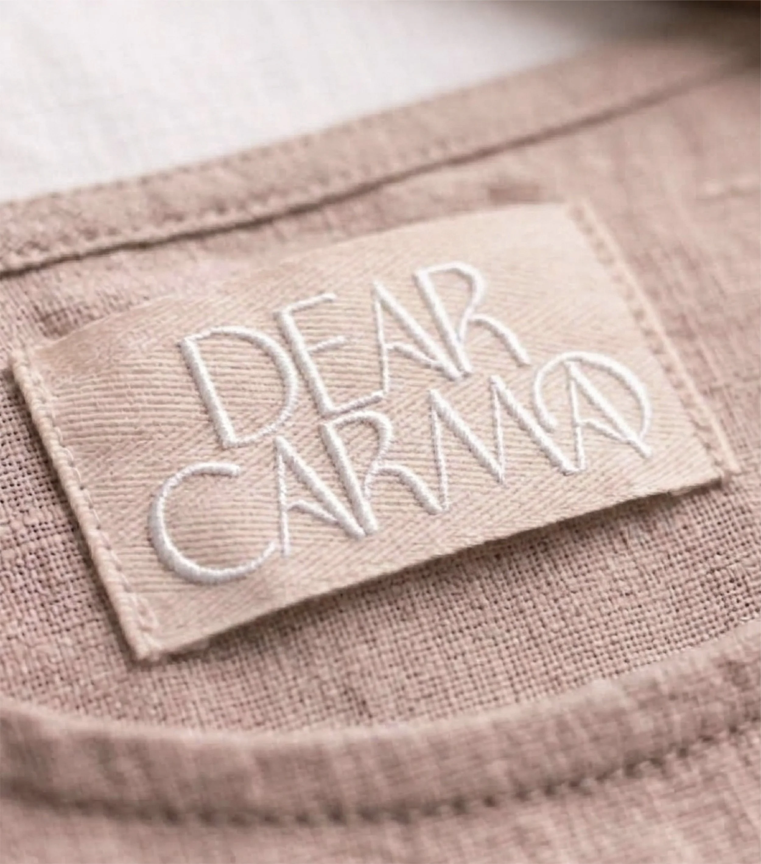
One of the primary brand values for Dear Carma is caring. This design signifies the personal element that exudes from the brand with this hand lettered logo. The human element is also a strong signifier for the brand in the hand made products that are cared and created by the independent designers and makers of the products themselves. The handwritten style love letter is also a connection to the two people who make up the brand name.