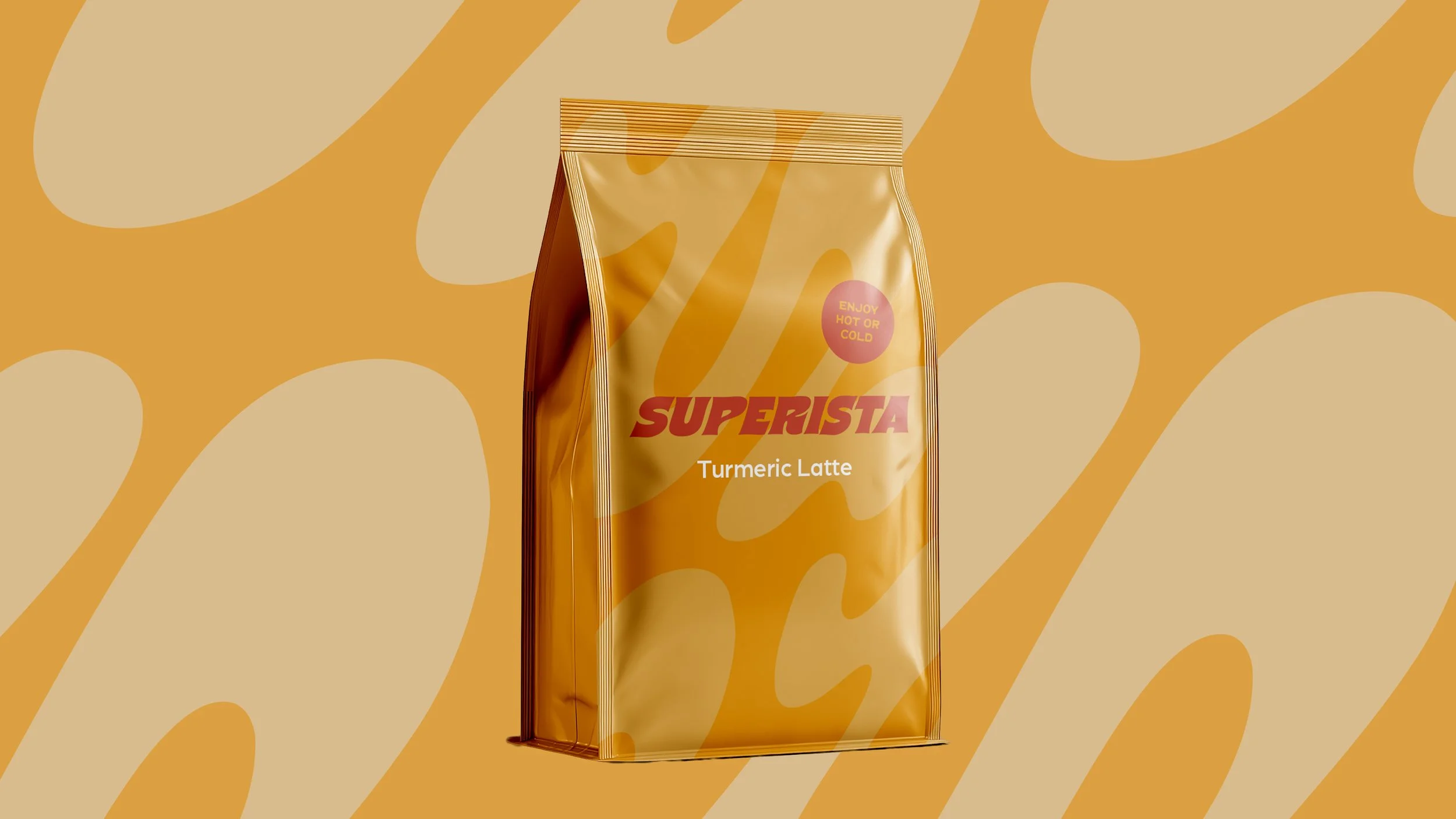
Superista
BACKGROUND
Modern cafés and mindful consumers are looking for clean, caffeine-free alternatives to syrupy coffee drinks, yet the market is saturated with clinical supplement powders, trend-chasing biohacks, and overly feminine pastel designs. Superista needed a distinctive, modern visual identity that stands out in the hotel, restaurant, and café sector. The challenge was creating a functional, colour-led brand that feels joyful and accessible without leaning into spa aesthetics, rainbow clichés, or pseudo-science.
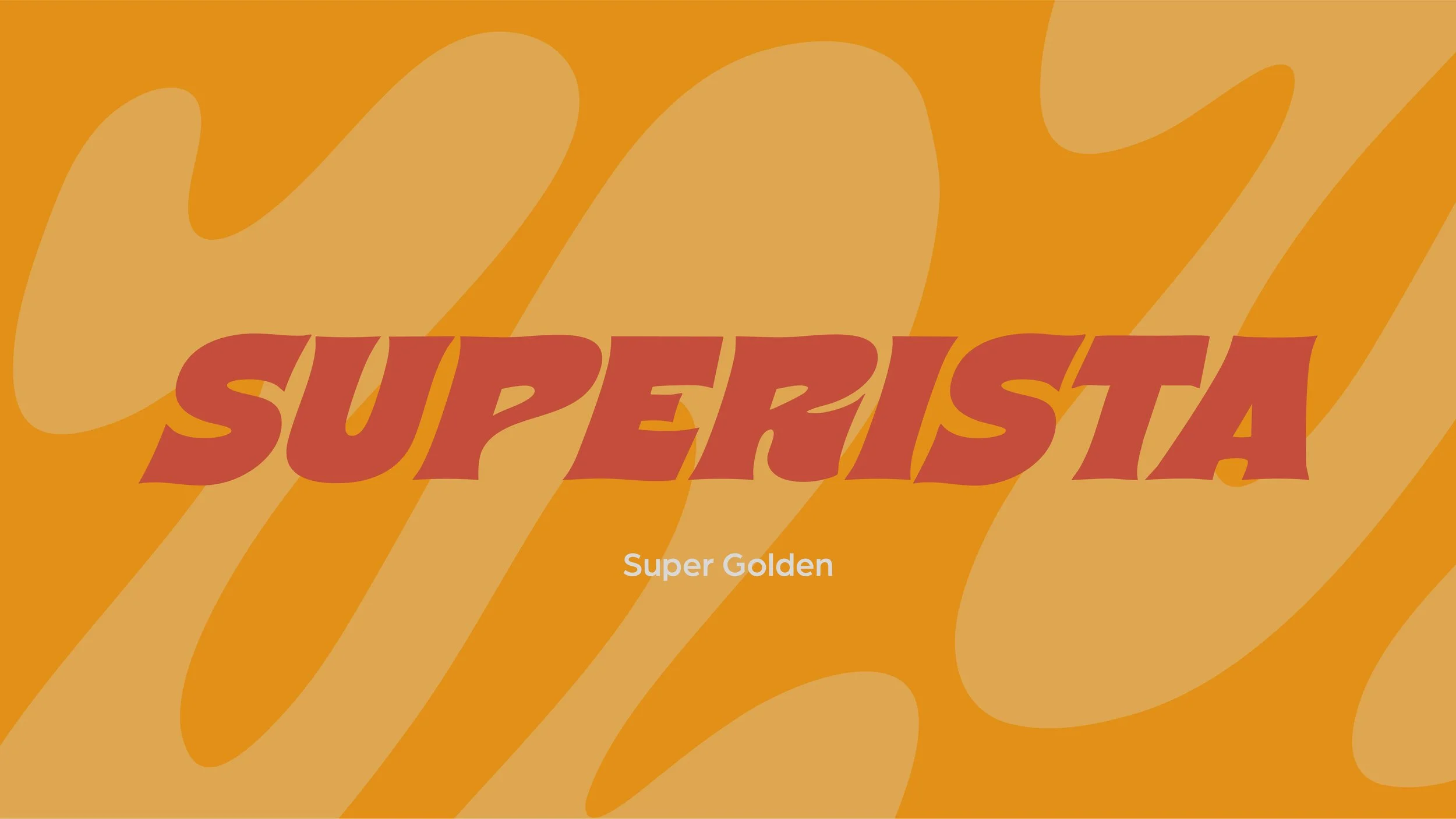
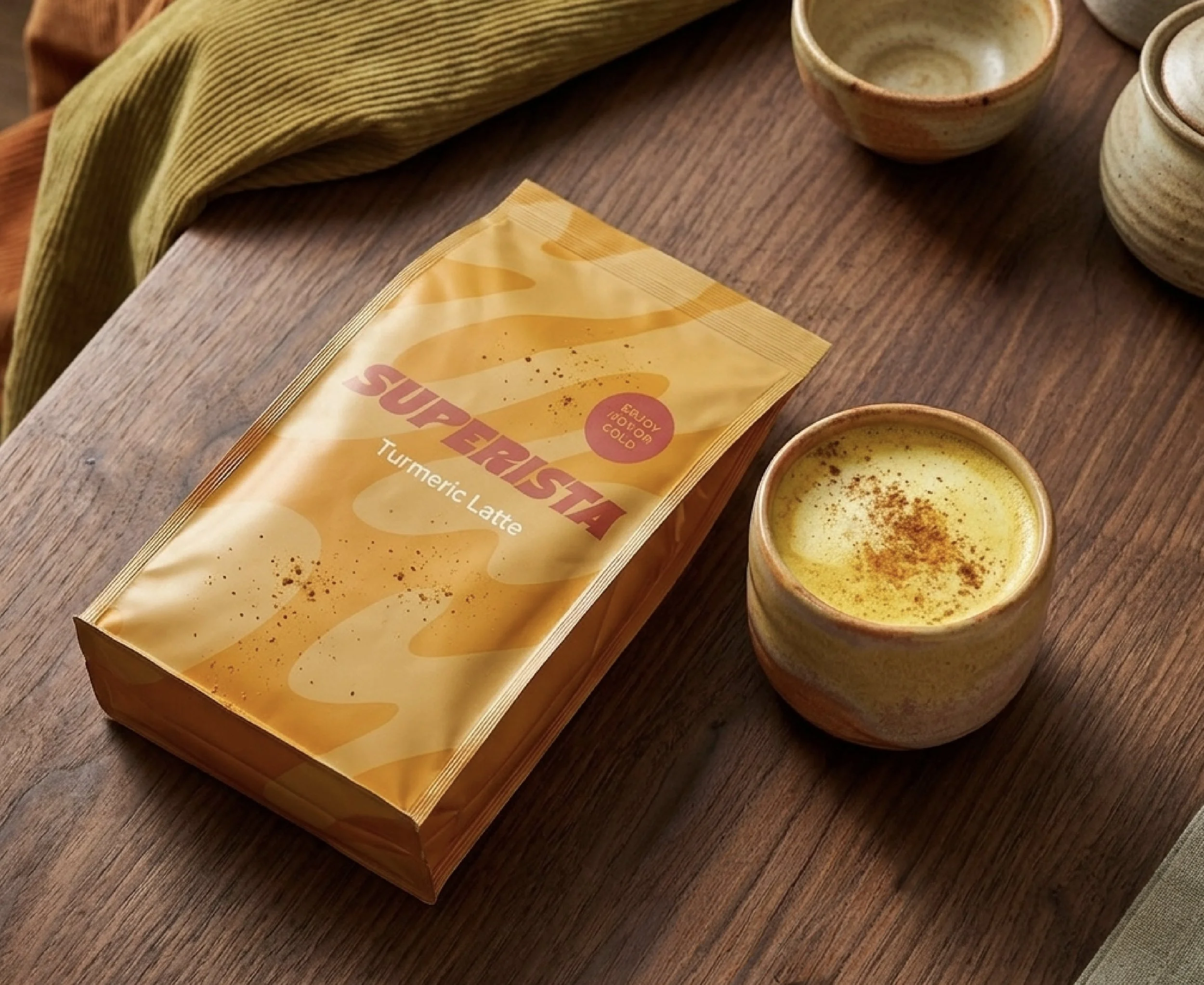
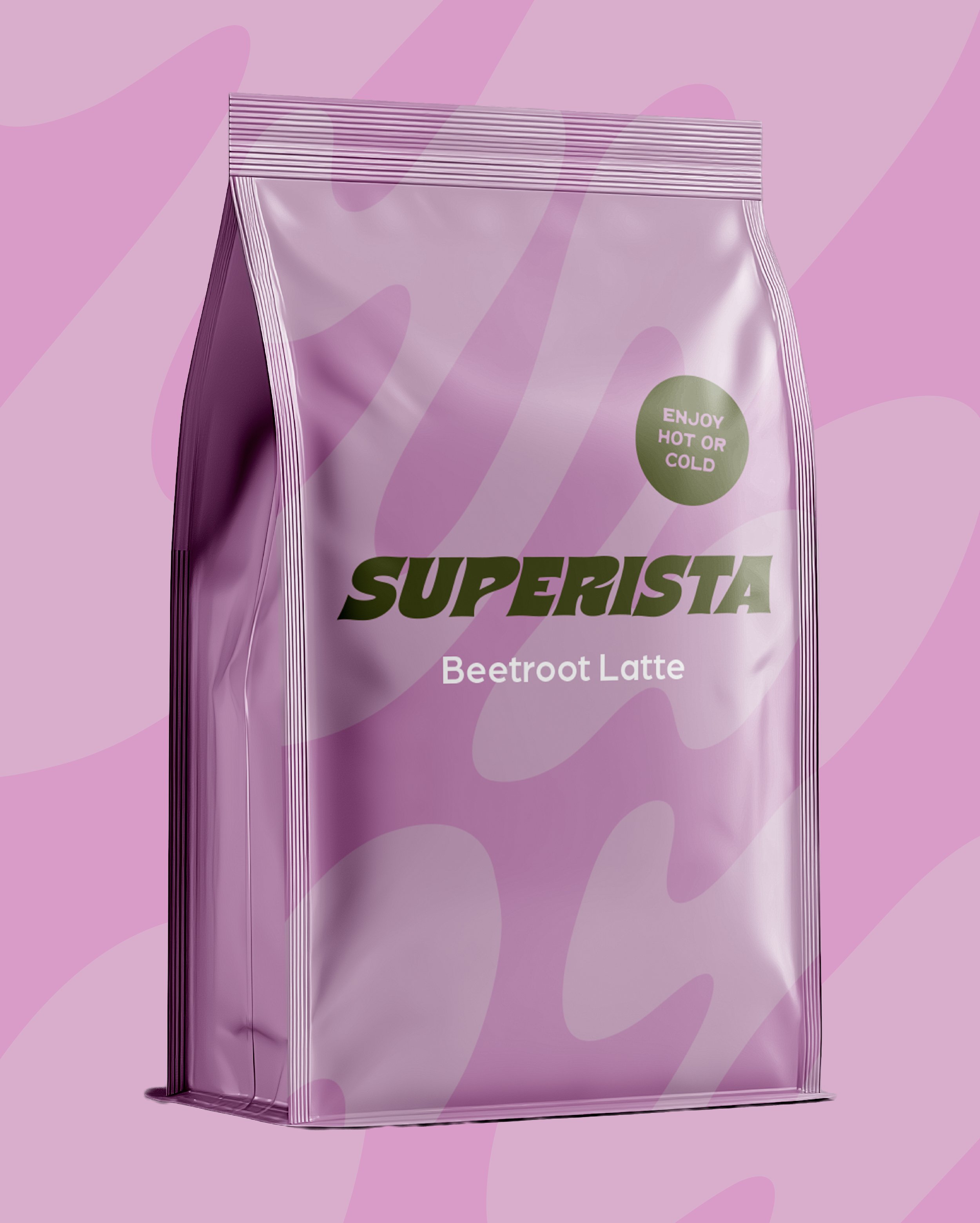
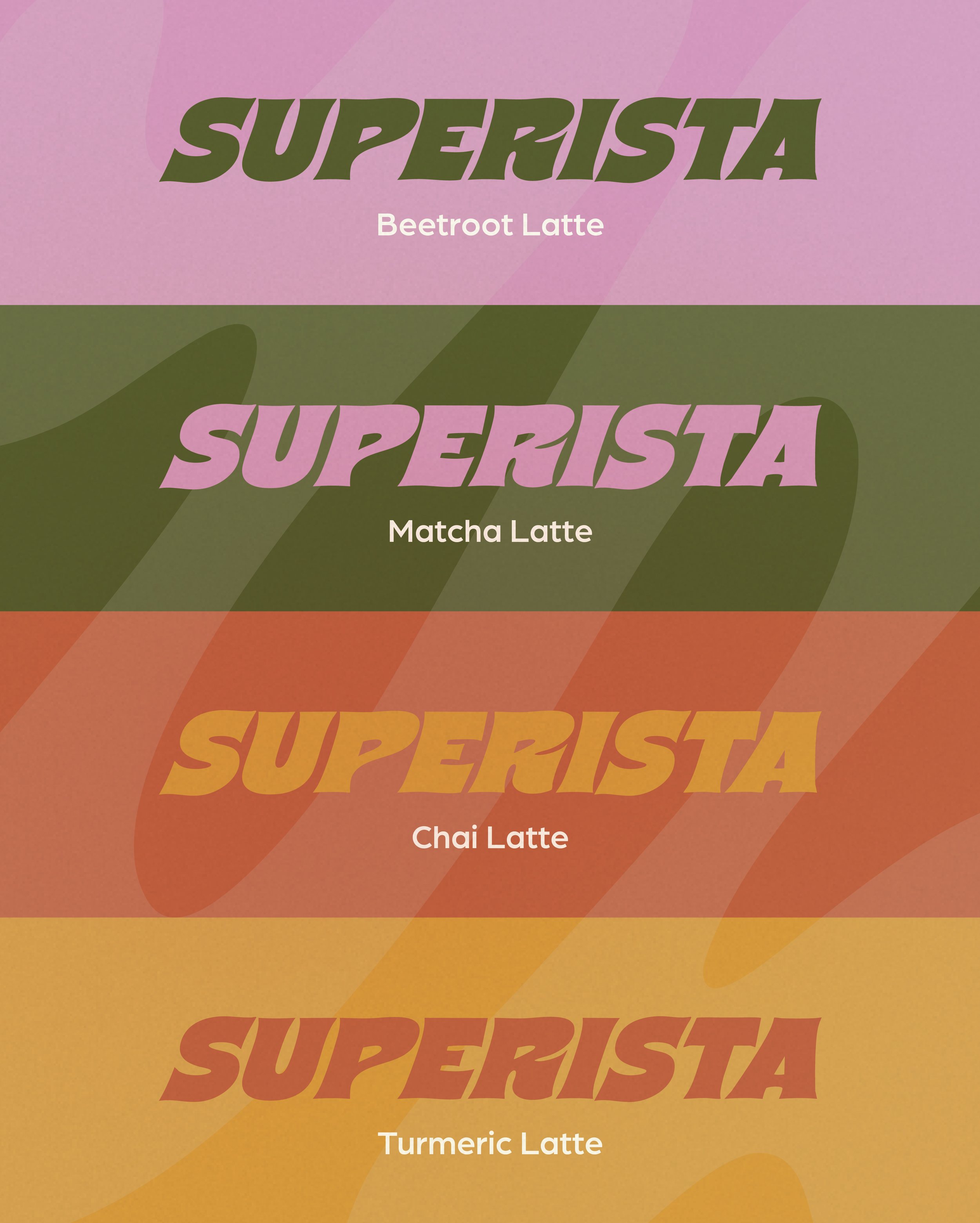
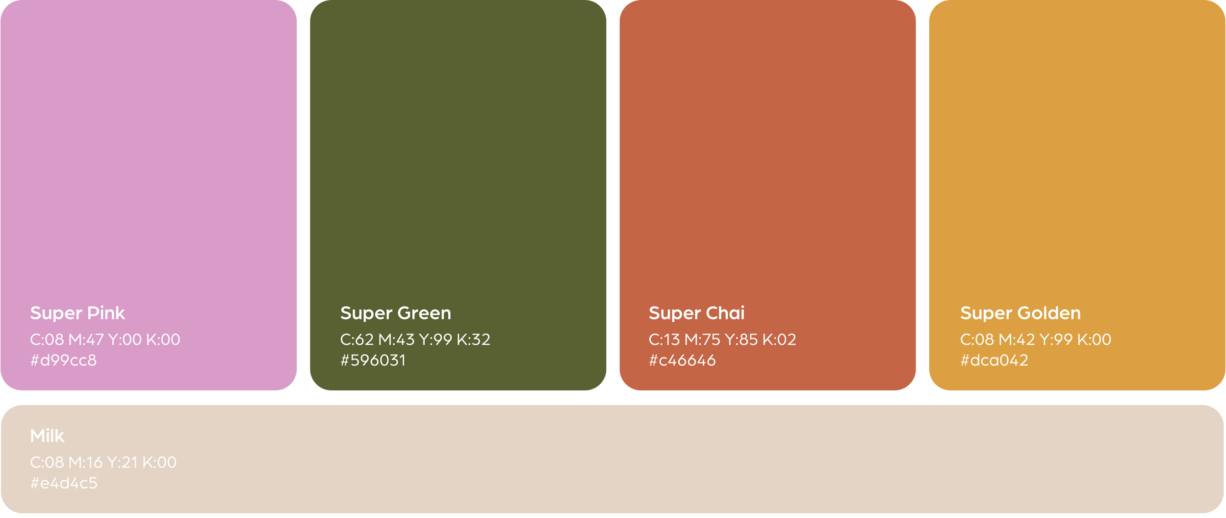
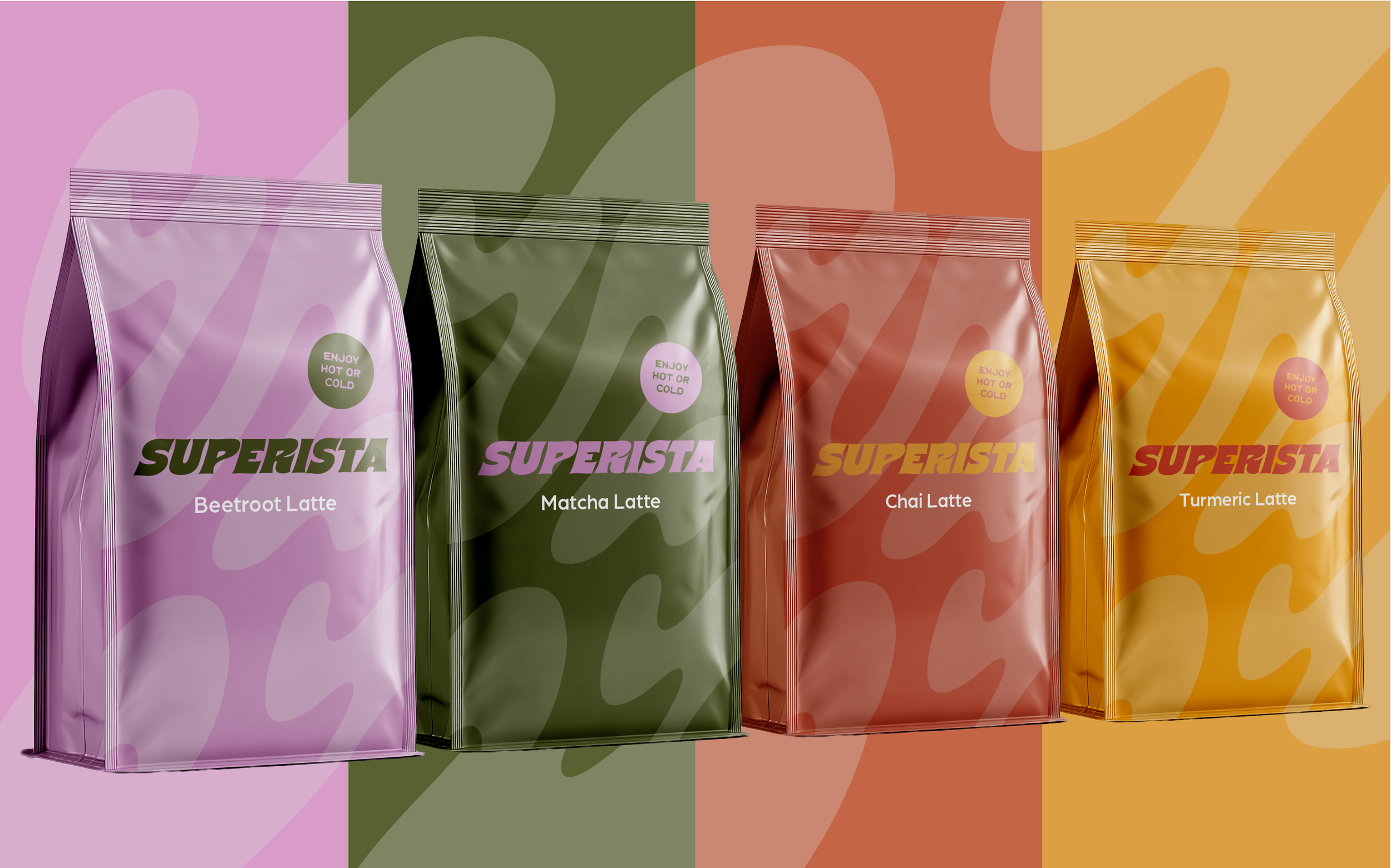
To cut through that noise, I opted for a relaxed 70’s colour palette to bring some grounded warmth to the brand such as turmeric gold and matcha green. The logo type captures the natural flow of the daily ritual that comes with making your morning drink with a smooth, fluid motion that echoes the texture of natural latte blends.
The resulting minimal packaging system delivers an instantly recognisable, barista-friendly brand that balances operational ease for cafés with an inviting daily ritual for consumers.